Cozy Nest
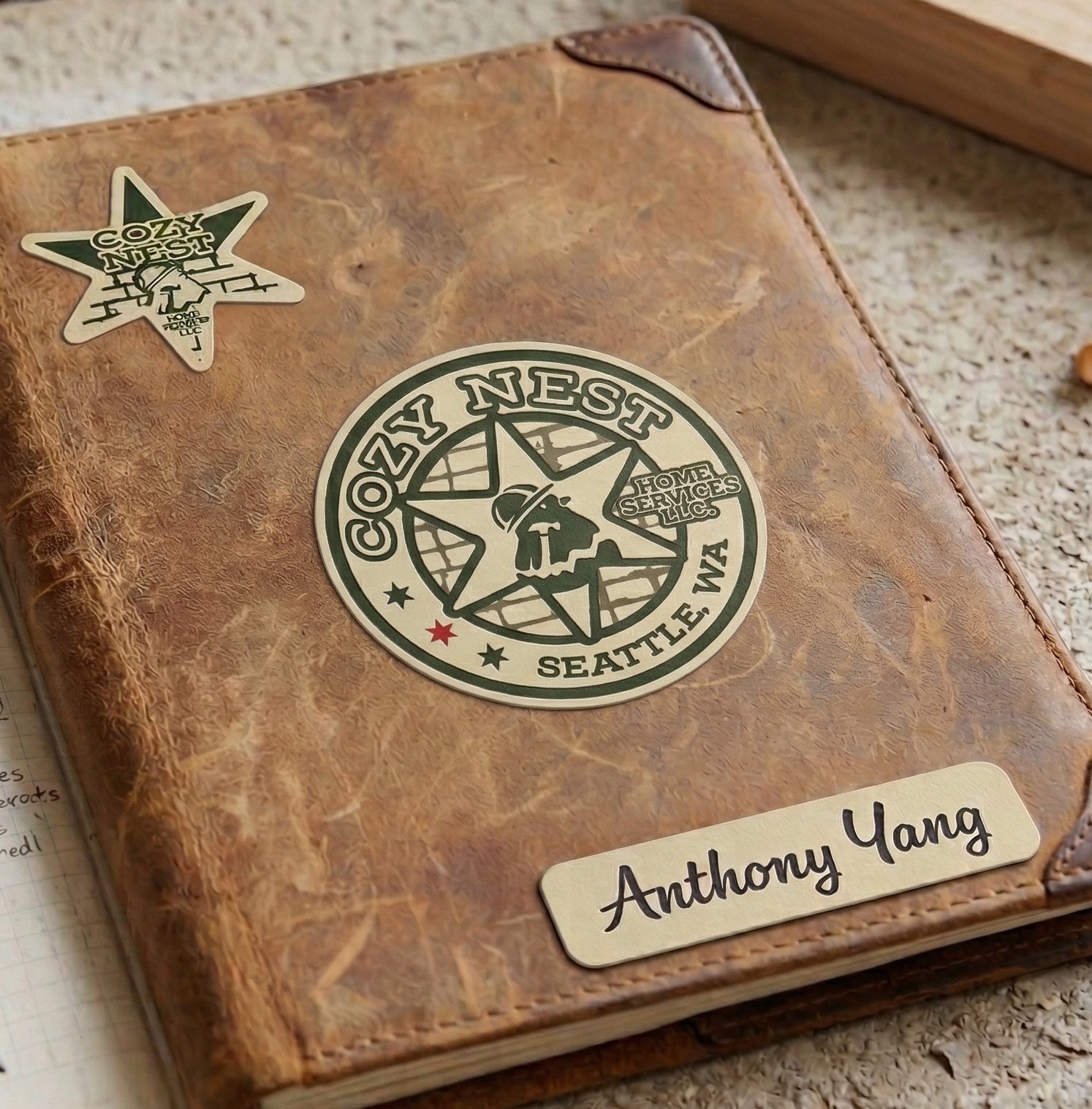
Brand identity and collateral for a general contracting company in Seattle. The client wanted a mark that felt trustworthy, with a baby chick in it to match the name.
The brief
Our client wanted a brand that signified quality and trust. He also asked for a baby chick in the logo to go with the company name, Cozy Nest. His point was beautiful: they build houses, and more than that, they build homes families love to live in.
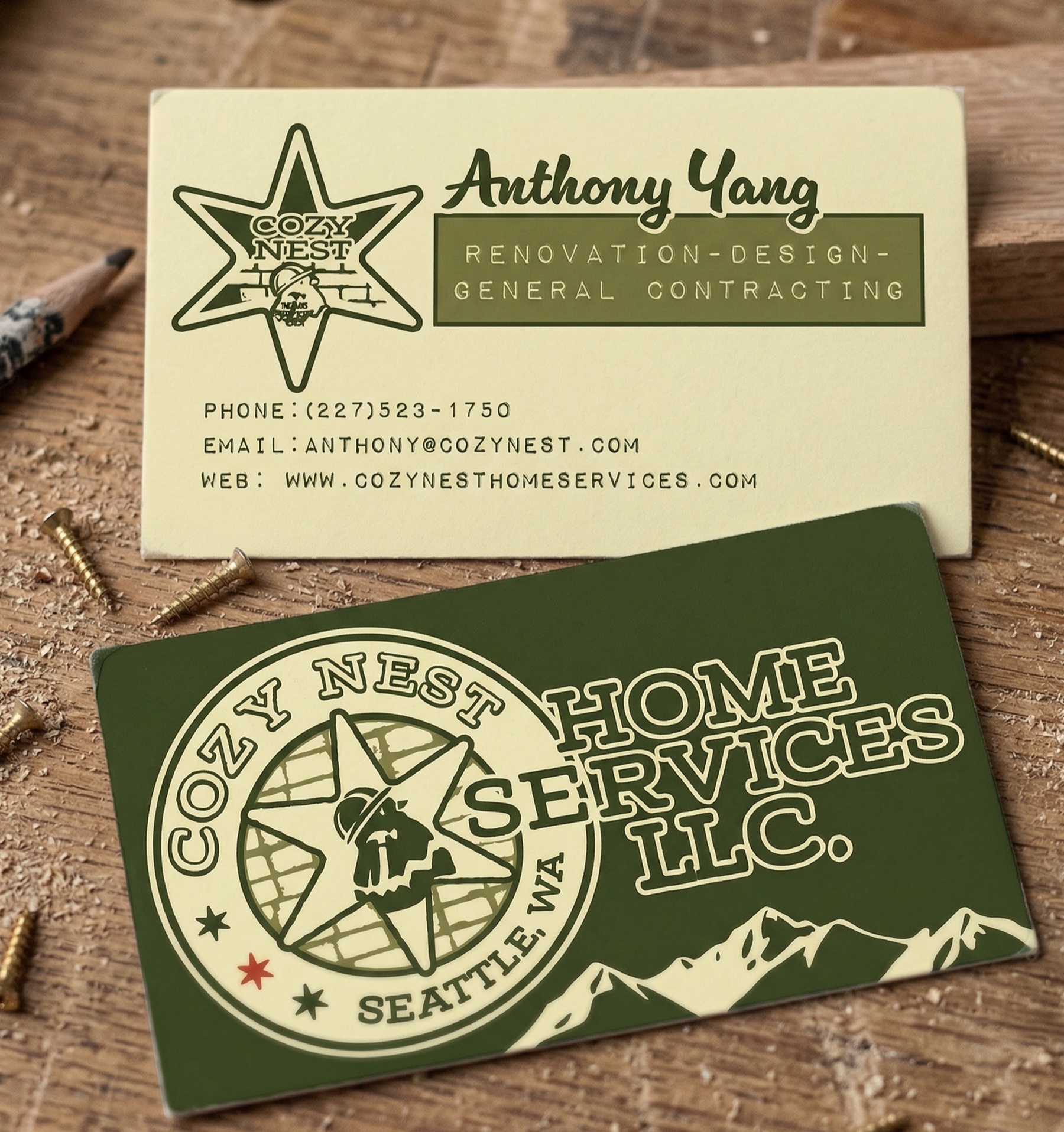
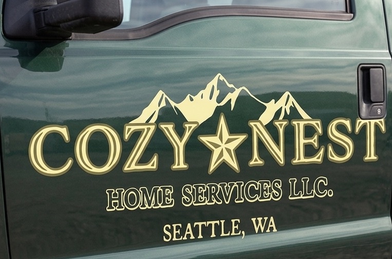
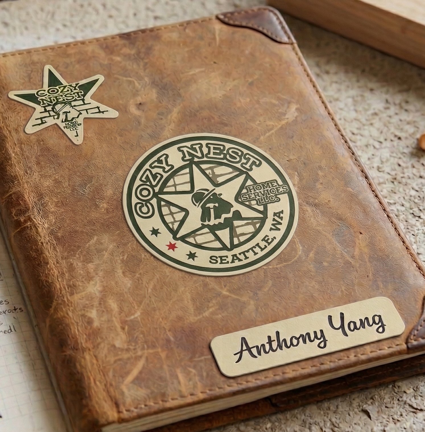
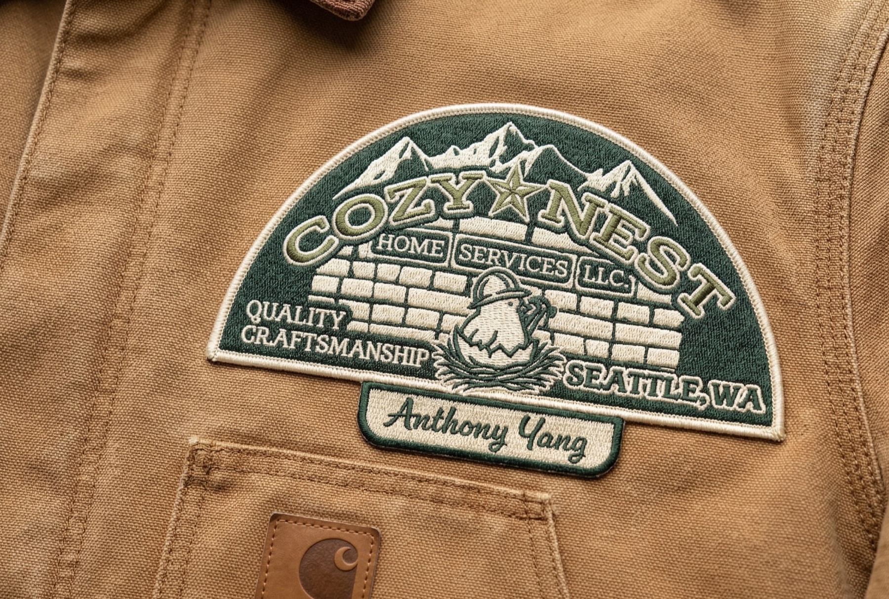
I landed on a badge-style mark: mountains, a star, and a hard-hatted chick standing on a brick wall. It carries the weathered confidence of decades on job sites, exactly the feeling a contractor wants. It runs across business cards, a field notebook, embroidered patches, and truck signage.
The website
A contractor's site has one job: earn enough trust that someone hands over their house. So it leads with finished rooms, and the two things a homeowner wants most, seeing the work and booking a conversation, always sit one click away. The consultation badge follows you down every page.
The badge mark does the heavy lifting on screen too. Deep teal and olive carry the sections, cream keeps the type readable over photographs, and the FAQ answers the tricky questions openly, right there on the page.