Tonko
Brand identity and sustainable packaging for a toy company making modular, non-toxic toys that leave plenty of room for a kid's imagination. Conscious toys for curious minds.
The brief
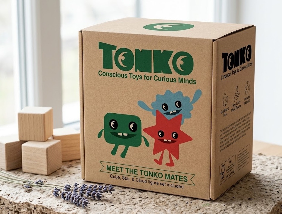
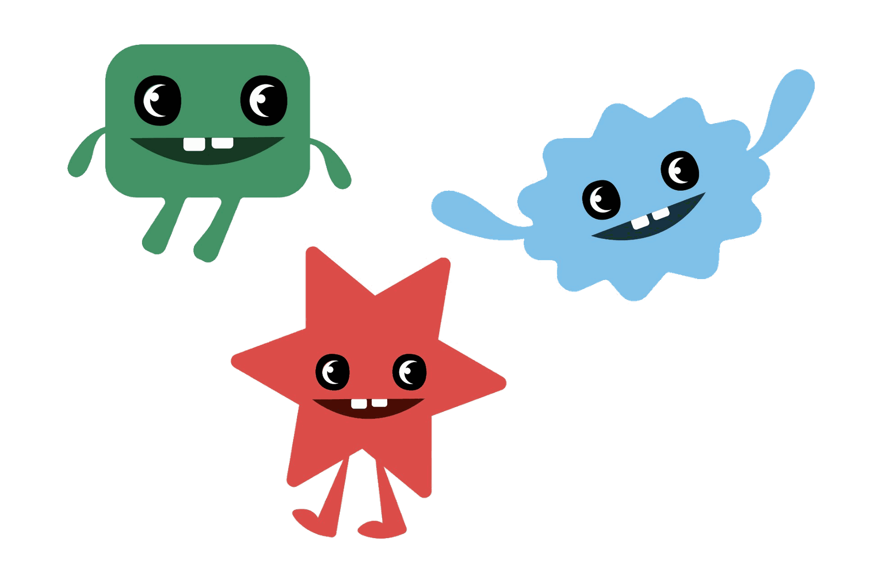
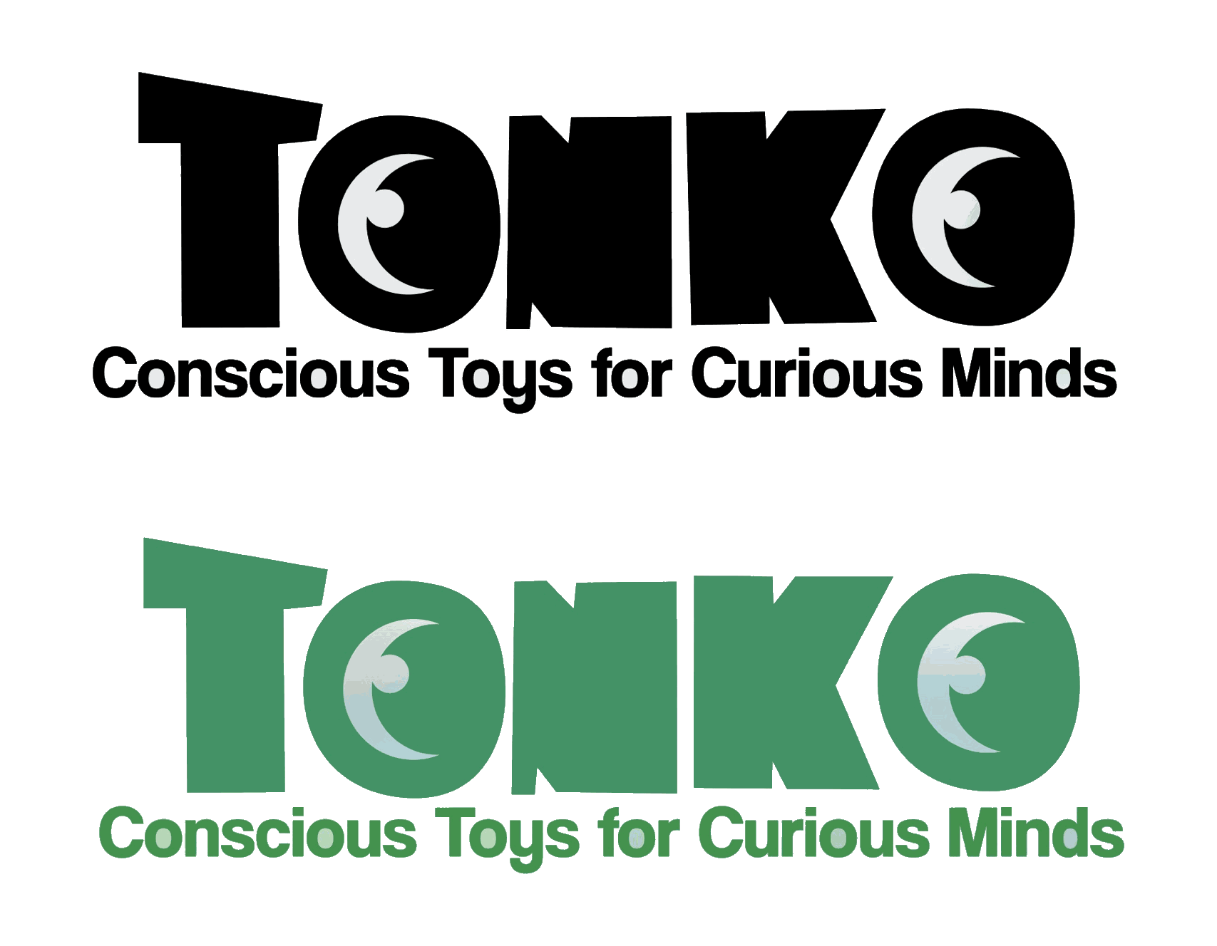
Tonko makes simple modular toys. Puzzle and building sets that bring out a kid's inner engineer, scientist, and artist. The brand needed to feel colorful and a little silly while staying sustainable and non-toxic, so kids start thinking about their own impact early. That started with the wordmark: bouncy letters with eyes built into them, plus a small cast of characters (Cube, Star, and Cloud) to carry the personality everywhere else.
Packaging is where the sustainability promise comes to life. Recyclable kraft cardboard for structure, soy-based inks, and reusable pieces like an organic cotton drawstring bag for loose parts. It costs a little more up front, and it's the part of the brand that makes the promise real.
In use
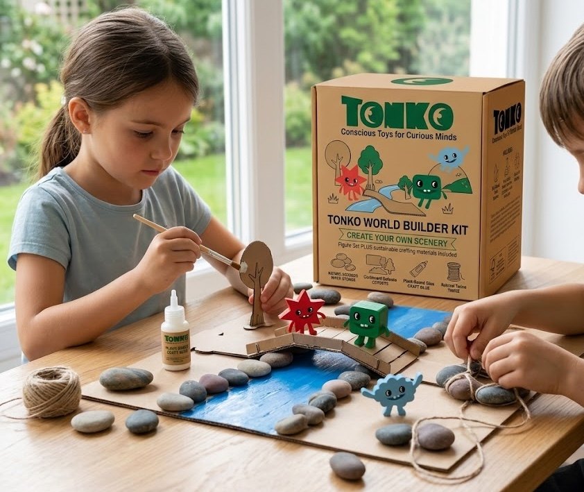
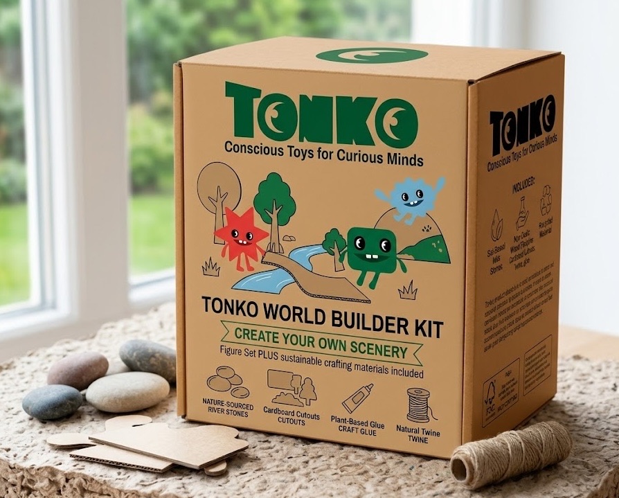
The kit tells the story. Cardboard cutouts, reclaimed wood, cork connectors, smooth river stones and a length of twine, with the finished shape left entirely to the child. What they build is a landscape for the three characters to live in, so the toy comes to life as somebody invents the rest of it.
That's also why the packaging stays so simple. The box leaves all the imagining to the kid.