Brand Identity, Guidelines & Tradeshow Design

QuantumCyte

A logo, brand guidelines, a tradeshow booth and marketing materials for QuantumCyte, a biotech startup whose tool brings new precision to micro-dissection for pathologists. The whole identity grew from an image their own technology produced.
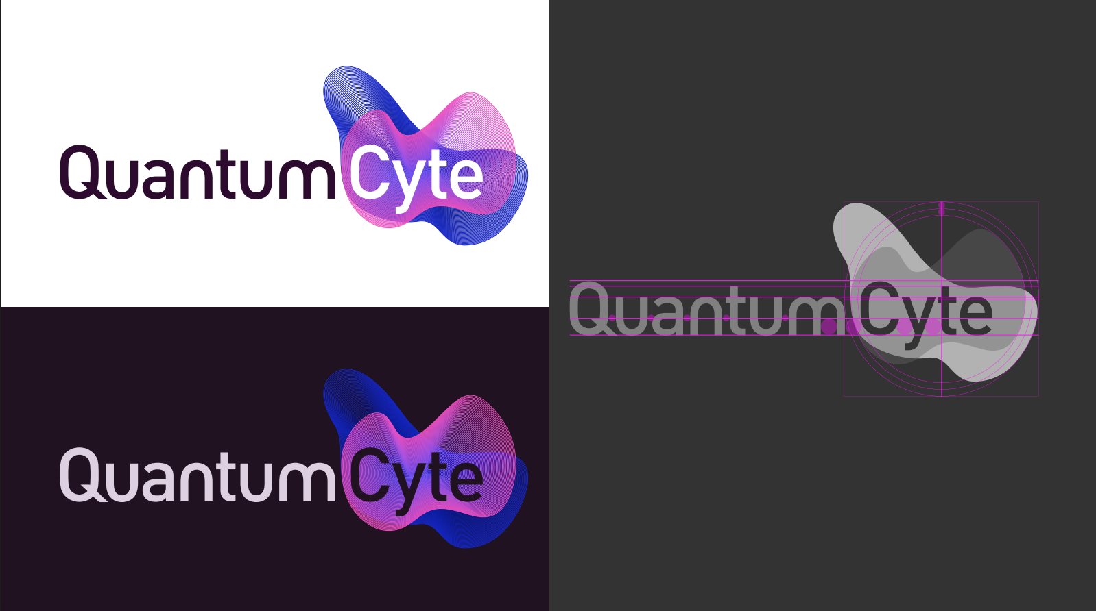
The final QuantumCyte logo: Quantum in dark purple and Cyte in white over a blue-to-pink gradient cell mark, shown on white, on deep purple, and as a grey monochrome version.
Client
QuantumCyte, biotech startup
Role
Logo design, brand guidelines, tradeshow booth design, marketing materials
Process
Discovery, ideation, iteration with the client, final system
Tools
Illustrator, Photoshop, Dimension
Guidelines
View the full PDF →
01 · Discovery

The answer was already under the microscope

The QuantumCyte team wanted a logo with clear roots in the science, and a palette that moved them into a whole new world, far from their old teal and orange. The feeling they asked for came in four words: futuristic, technical, modern, sleek.

The inspiration came from the work itself. Their tool produces images of stained tissue, dense and organic and full of magenta and violet. That single image set the color palette and the imagery for everything that followed.
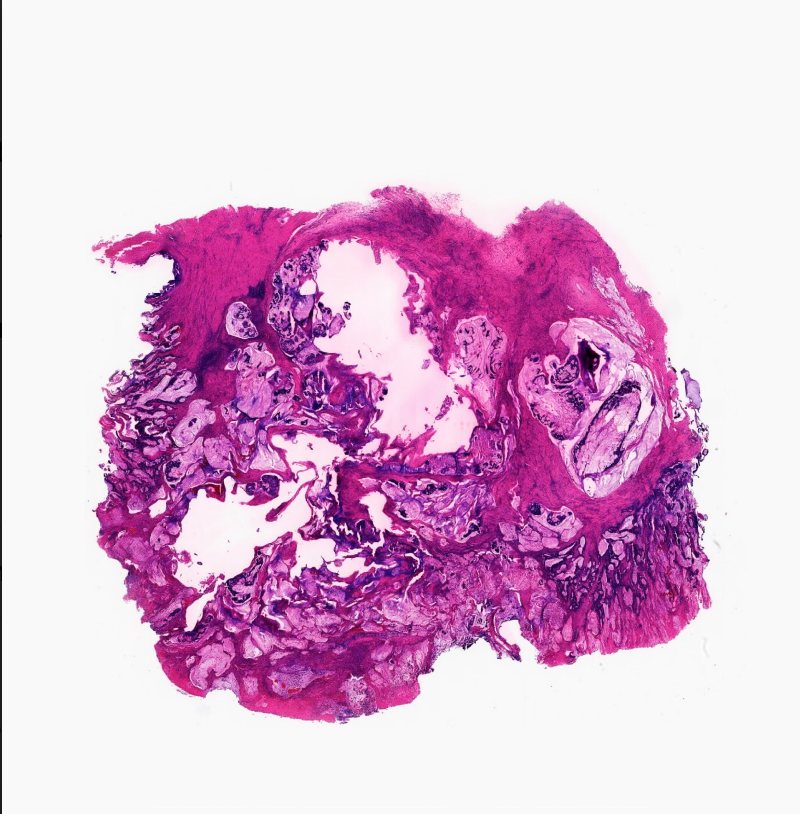
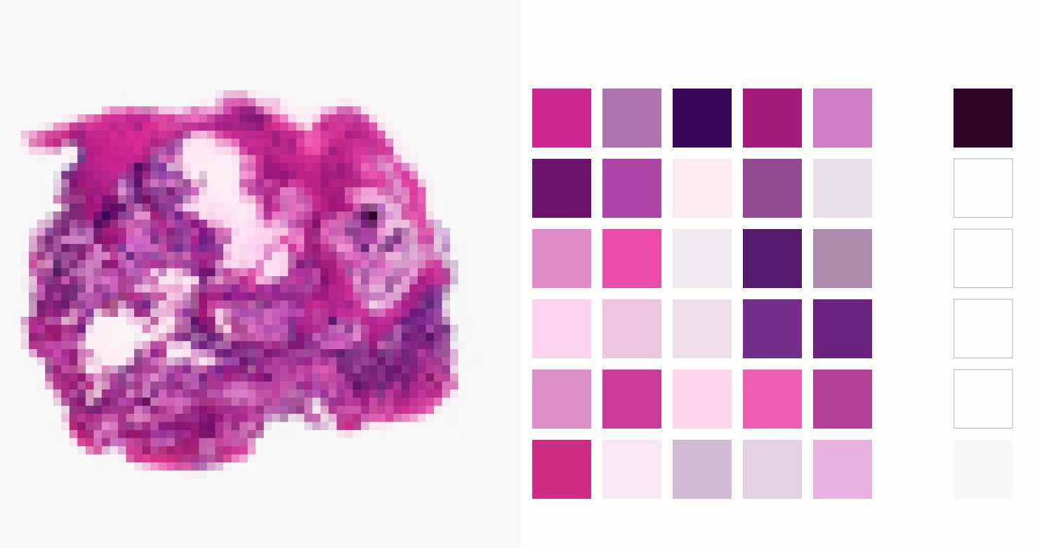
A stained tissue sample produced by QuantumCyte technology: an organic mass of magenta, violet and white.
The source. An image produced by QuantumCyte’s own technology.
The same tissue image pixelated beside a grid of magenta, violet, lilac and pale pink swatches pulled from it.
The palette, pulled from the cells. Pixelating the image turned its colors into a working range of swatches.
02 · Ideate

Idea dumping and blob exploration

The early stage was pure play. I sketched the wordmark by hand again and again beside loose, cell-like forms, noting the imagery the brand called for: 3D, pink and blue, sleek, organic.

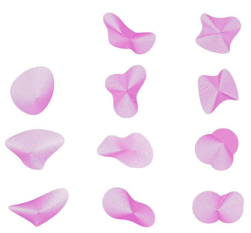
Then the blobs moved into three dimensions. A family of rendered forms let us test how organic the mark could feel while still reading as precise, technical and new.
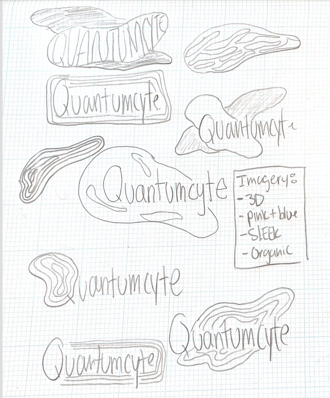
A page of pencil sketches on graph paper: the QuantumCyte wordmark drawn many ways beside organic blob shapes, with notes reading imagery: 3D, pink and blue, sleek, organic.
Idea dumping. The wordmark and the blob, worked out together in pencil.
A grid of nine soft pink 3D rendered blob forms, each a different organic shape.
Blob exploration. Rendered forms to find the right balance of organic and precise.
03 · Iterate

From early rounds to the final mark

I experimented with a few shapes and color stories and shared them with the client. Together we narrowed in on the version that both of us felt carried the heart and soul of QuantumCyte: a dimensional gradient cell sitting behind Cyte, with Quantum in deep purple beside it.

The final logo arrived with a full set of variations, including a monochrome version and a bare-bones wordmark, so the mark works across every print and web surface. It became the starting point for the rest of the brand.
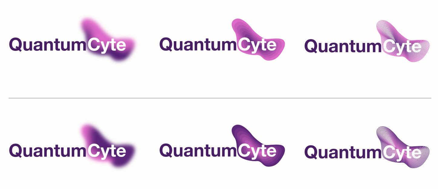
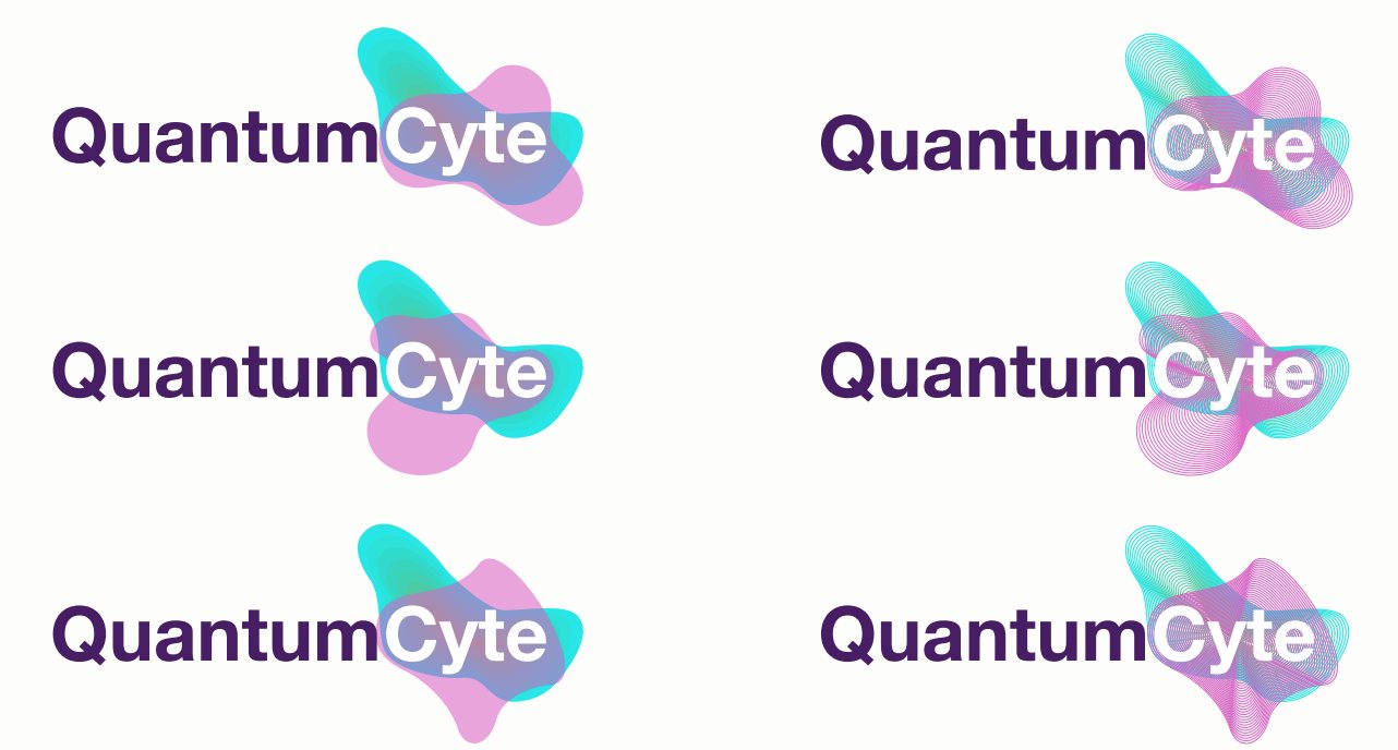
Six early QuantumCyte lockups with purple gradient cell marks in slightly different shapes.
Round one. Purple cell marks, each a slightly different shape.
Six early QuantumCyte lockups pairing purple type with teal and pink gradient cell marks.
Round two. Teal and pink gradients, testing a brighter color story.
04 · Brand guidelines

A system the whole team can use

The guidelines give every version of the logo a clear job: the primary lockup for white and for dark backgrounds, a monochrome version for documents and presentation headers, a bare-bones wordmark for emails and pitches, and versions for black-only and black and white printing. Clear space around the mark always equals the height of the “u” in Quantum.

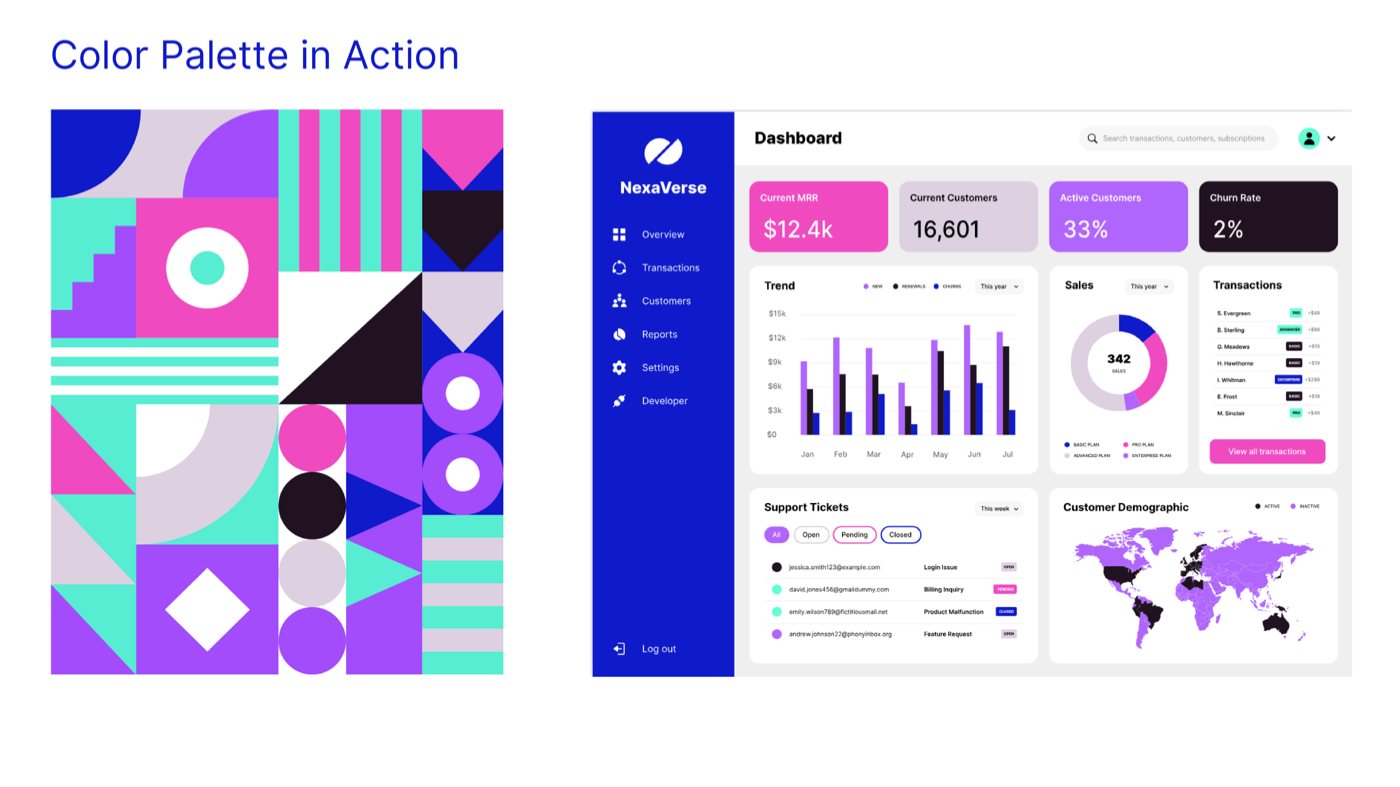
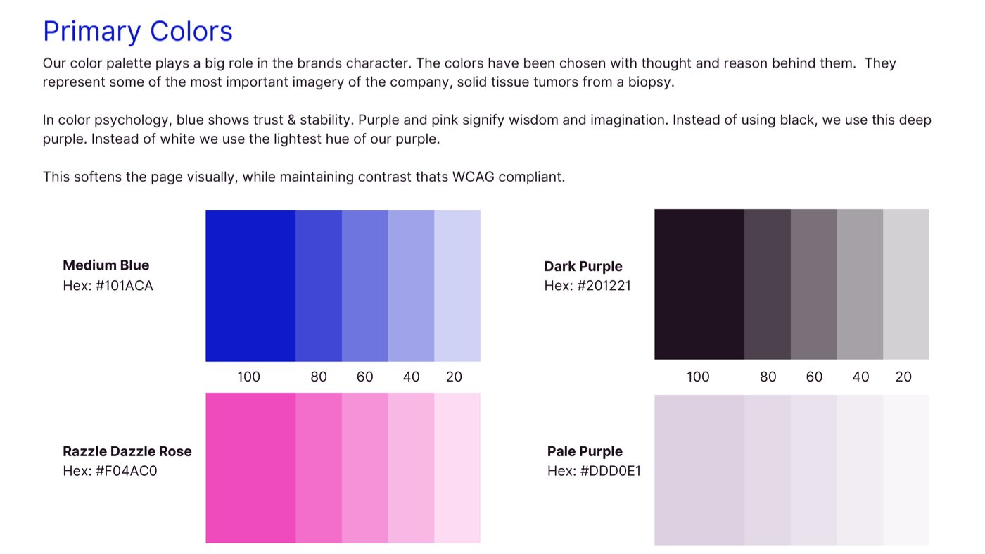
The primary palette carries the story of the tissue imagery. Medium Blue signals trust and stability, while Razzle Dazzle Rose and the purples speak to wisdom and imagination. Dark Purple stands in for black and Pale Purple for white, softening every page while keeping contrast WCAG compliant. Electric Purple and Turquoise join as accents, used one at a time.

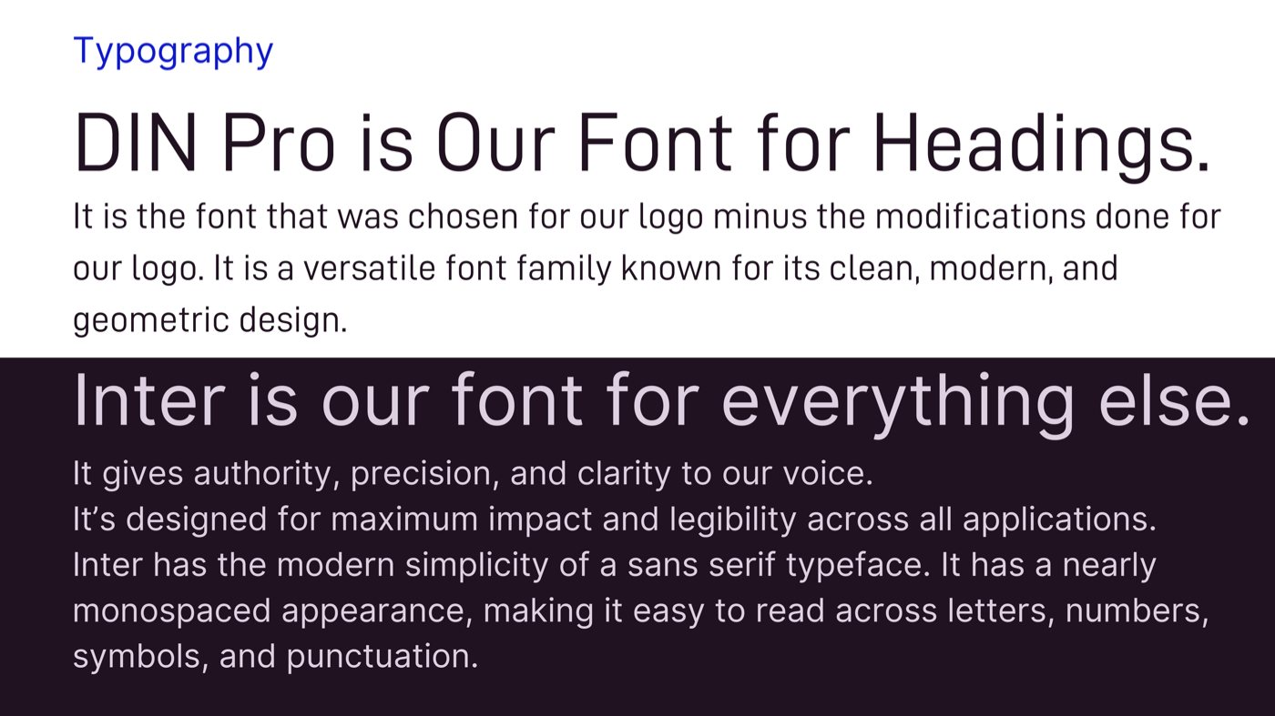
Type pairs DIN Pro for headings, the face behind the logo, with Inter for everything else, set in a light weight so the vivid colors can shine.
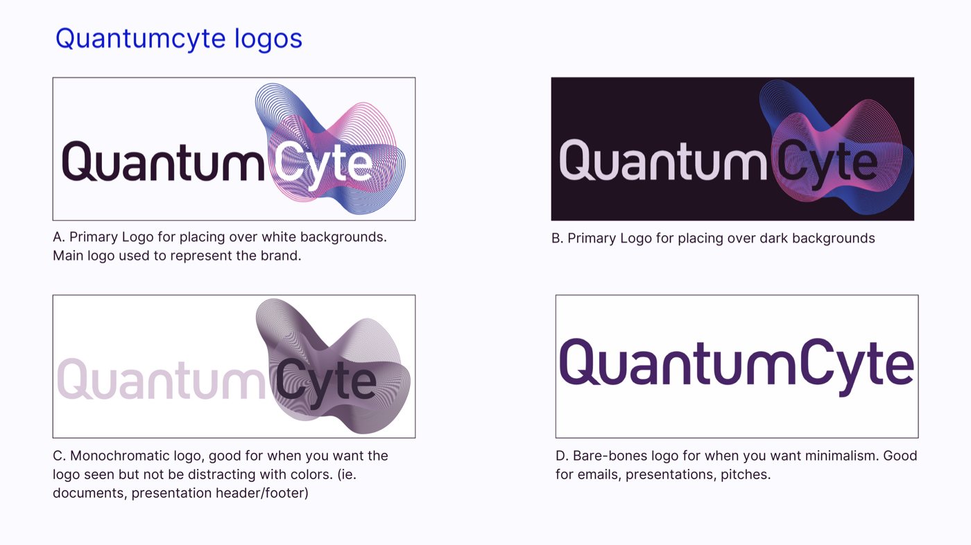
Brand guidelines page showing four QuantumCyte logo versions: primary on white, primary on dark, monochromatic, and bare-bones, each with a note on when to use it.
Logo versions. One mark, a clear use for each version.
Brand guidelines page of primary colors: Medium Blue, Dark Purple, Razzle Dazzle Rose and Pale Purple, each with tints from 100 down to 20.
Primary colors. Medium Blue, Razzle Dazzle Rose, Dark Purple and Pale Purple, with tints.
Brand guidelines page showing the palette in use: a geometric pattern of pink, turquoise and purple shapes and a dashboard interface in the brand colors.
Color in action. The palette applied to pattern and interface.
Brand guidelines typography page: DIN Pro for headings and Inter for everything else, each with a short explanation.
Typography. DIN Pro for headings, Inter for everything else.
05 · Tradeshow & marketing

From a 3D plan to a real booth

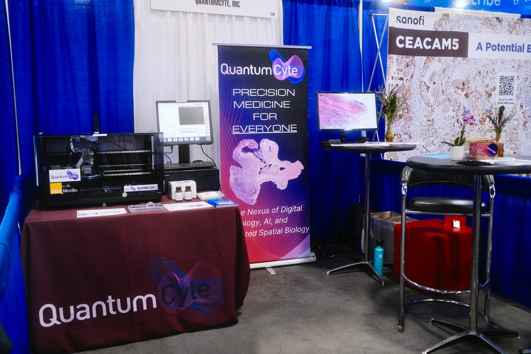
This was QuantumCyte’s first big tradeshow, so the booth stayed simple and focused. I built a 3D rendering to plan the layout and chose rentals that fit the company’s budget, then carried the new identity onto the backdrop, the pull-up banner and the table.

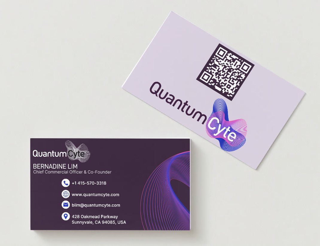
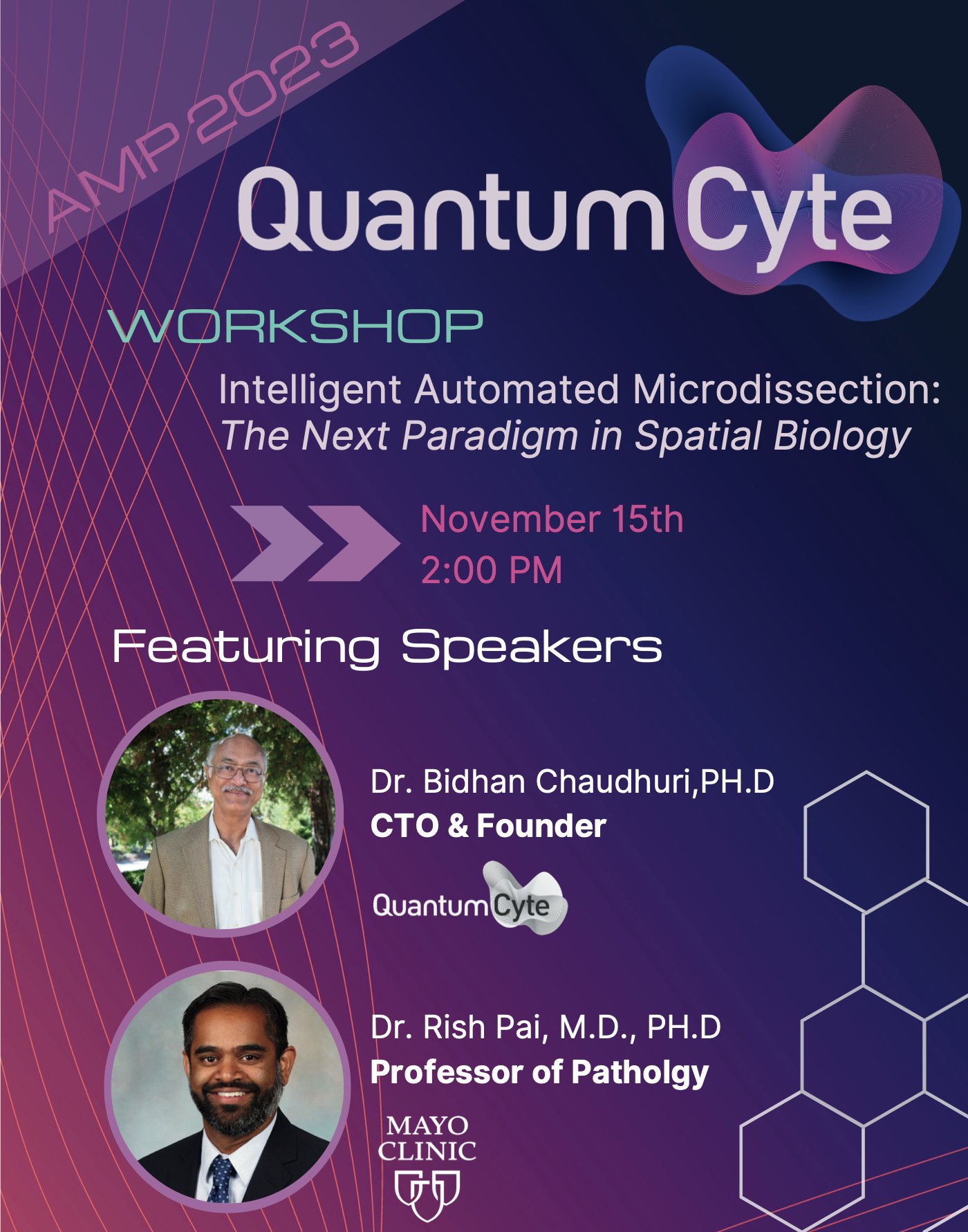
The system traveled into print too: business cards with the cell mark and a QR code, and a poster for QuantumCyte’s workshop at AMP 2023 on intelligent automated microdissection.
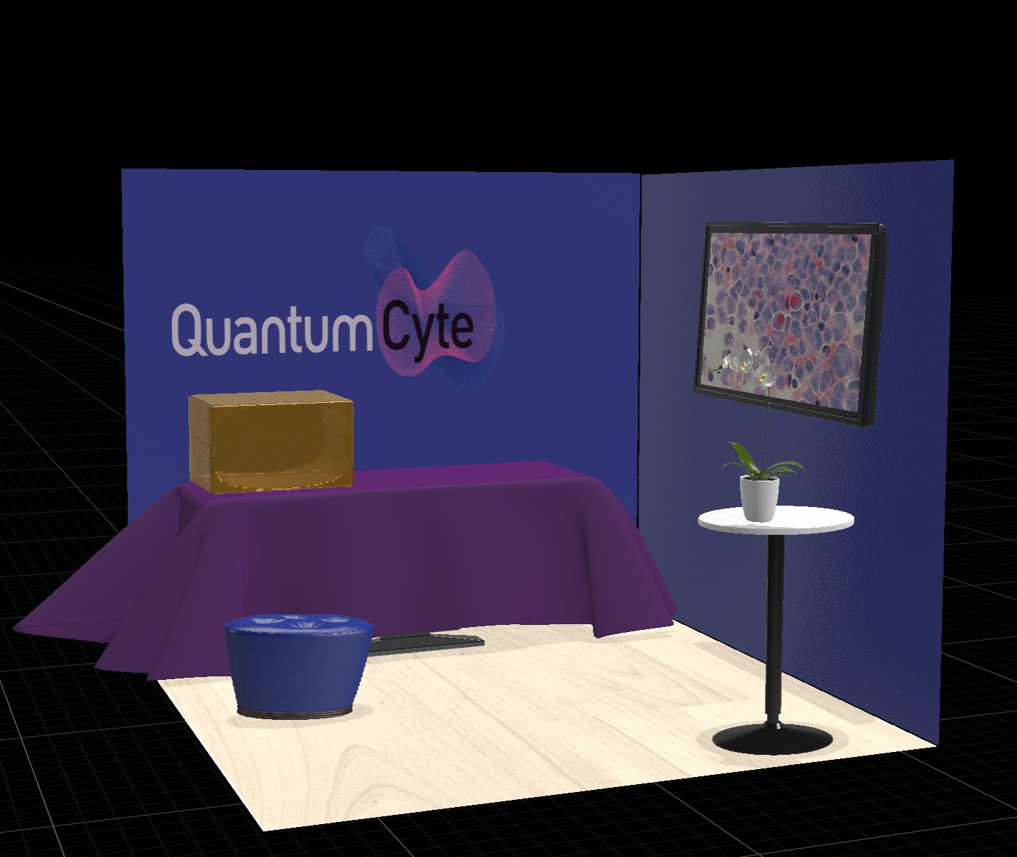
A simple 3D render of the QuantumCyte booth: a navy backdrop with the logo, a purple-draped table, a cocktail table with a plant, and a framed tissue image.
The plan. A 3D render to map the layout and the rentals.
The finished QuantumCyte booth at the tradeshow: a draped table with the logo, a microscope workstation, a monitor, and a pull-up banner reading Precision Medicine for Everyone.
The real thing. The booth on the show floor, with the new identity throughout.
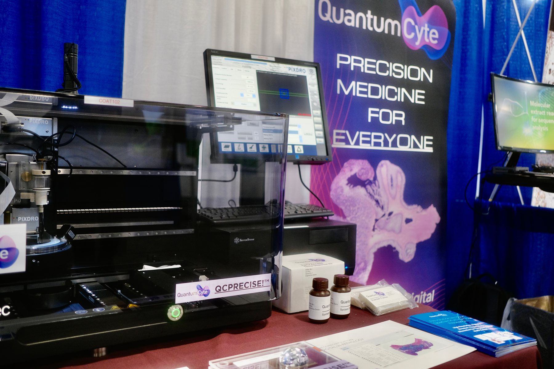
Close view of the QuantumCyte booth: an automated microdissection instrument beside the pull-up banner reading Precision Medicine for Everyone.
The banner beside the instrument. The tissue imagery runs up the banner behind the product.
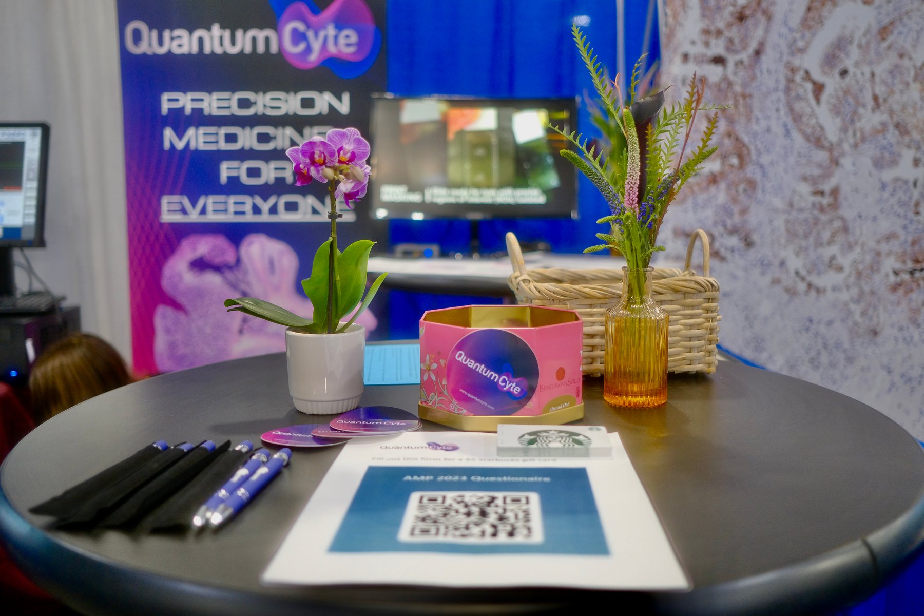
The QuantumCyte cocktail table at the booth, set with orchids, branded pens, a round logo tin and a QR code card, in front of the backdrop.
Details on the table. Branded pens, a logo tin and a QR code to keep the conversation going.
QuantumCyte business card mockup: a lilac back with a QR code and the logo, and a deep purple front with contact details and swirling line graphics.
Business cards. The mark and a QR code on the back, linework on the front.
Poster for the QuantumCyte workshop at AMP 2023, Intelligent Automated Microdissection: The Next Paradigm in Spatial Biology, with two featured speakers on a purple gradient.
AMP 2023 workshop poster. The gradient and linework carried onto a 22 by 28 inch poster.