Pacific Outdoor Living
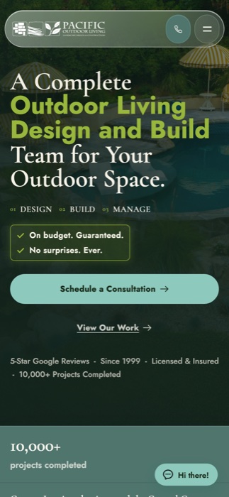
Pacific Outdoor Living has been building outdoor spaces around LA since 1999. Their competitors carried much bigger ad budgets, so we won on clarity. I designed and wrote the whole site.
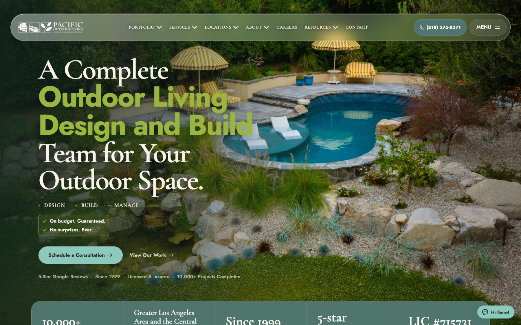
Sell the way they truly work
Pacific Outdoor Living's real advantage has always been how they run. In-house crews, their own permitting department, five real design meetings before anyone breaks ground, and wholesale material pricing passed straight to the homeowner. The new site needed to let all of that shine.
I was in-house, so I could walk over and ask. I sat down with the designers who lead those meetings, the owners who set the standards, and the marketing team who owns lead volume. Then I turned everything they shared into structure.
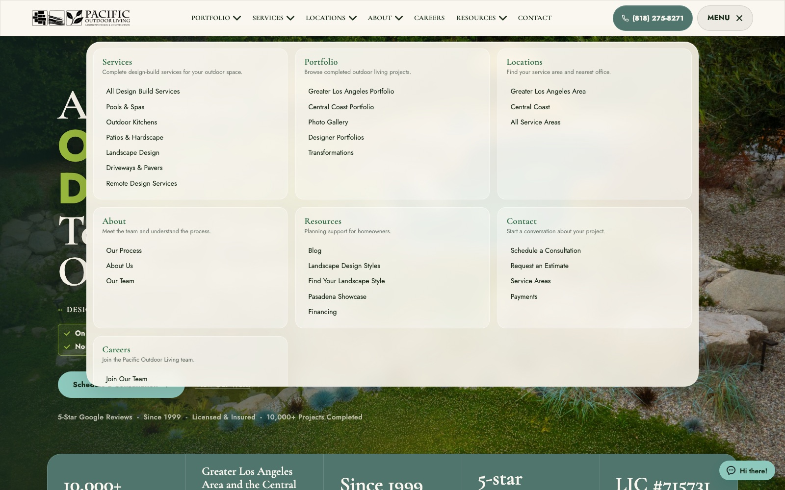
Make the process the product
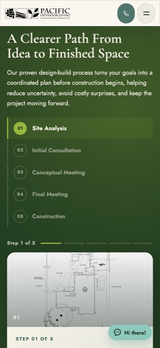
People spend five or six figures on a backyard once they know exactly what they're signing up for. So the process gets told twice. Once as the company's method, and once on a real backyard, using the same five steps both times so the pitch and the proof line up.
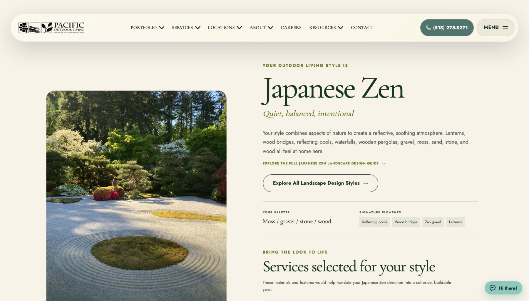
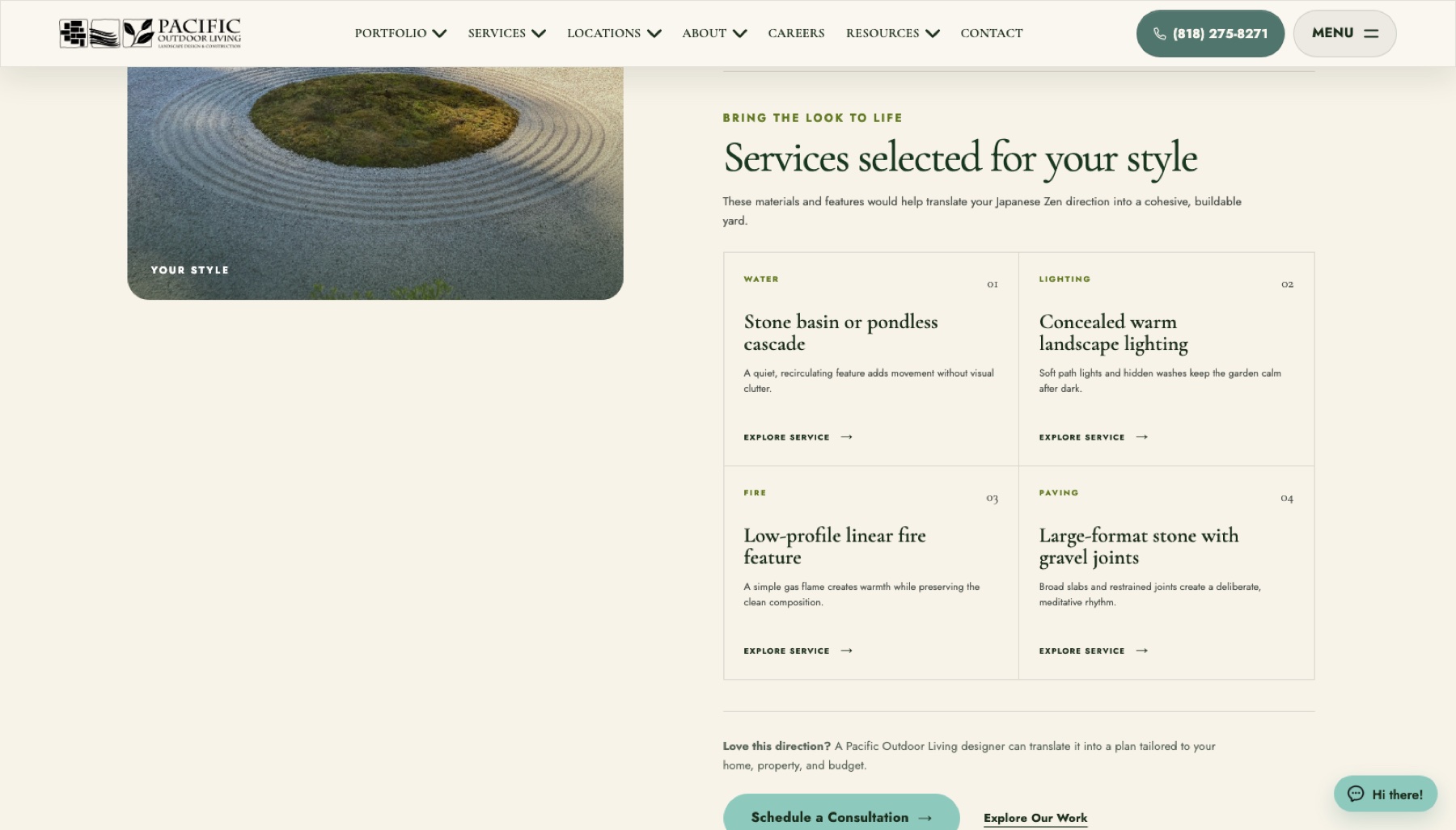
Turn browsing into a conversation
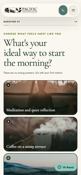
Asking a first-time visitor to book a consultation is a big ask. The quiz asks for something small and delightful. Fourteen picture questions, three minutes, one result. It works like a lead qualifier and plays like a fun quiz, and it ends by naming the services that would build the look you just picked.
Answer the big question first
A design-build company that covers part of a metro saves everyone time by answering the location question up front, and welcomes homeowners who might assume they're out of range. The address checker settles it in one step, then sends everyone who qualifies straight to the nearest showroom and a booking.
Show it, let them feel it
Every competitor on the page uses the word transformation. Dragging the handle across someone's real backyard shows it better than any adjective, and it gives people something to play with, which keeps them around.
Built for a phone in the backyard
Most of these people are standing in the yard they want to change, on a phone, in full sun. So everything is built to shine there. Photo answers stay full-width and thumb-sized, the process stepper stacks neatly, and the call button stays on screen the whole way.
Average user engagement
Roughly doubled
Compared to the old site, after the new one launched.
Average sales from the website
$127,514 → $220,480
Before and after the redesign.
Carry the story beyond the site
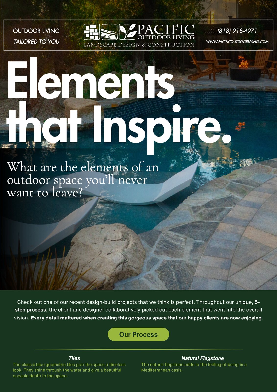
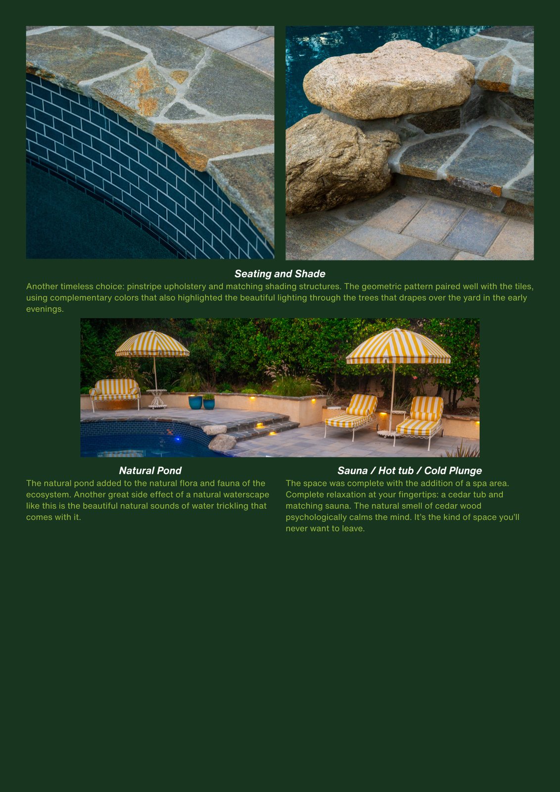
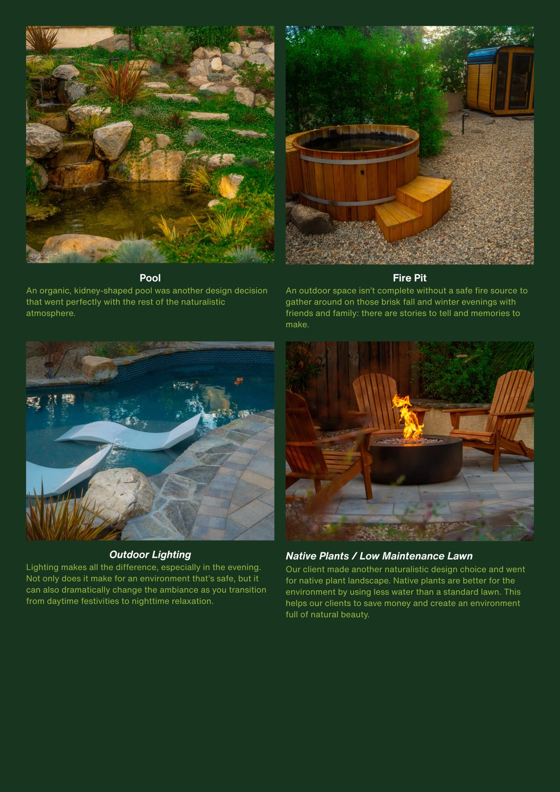
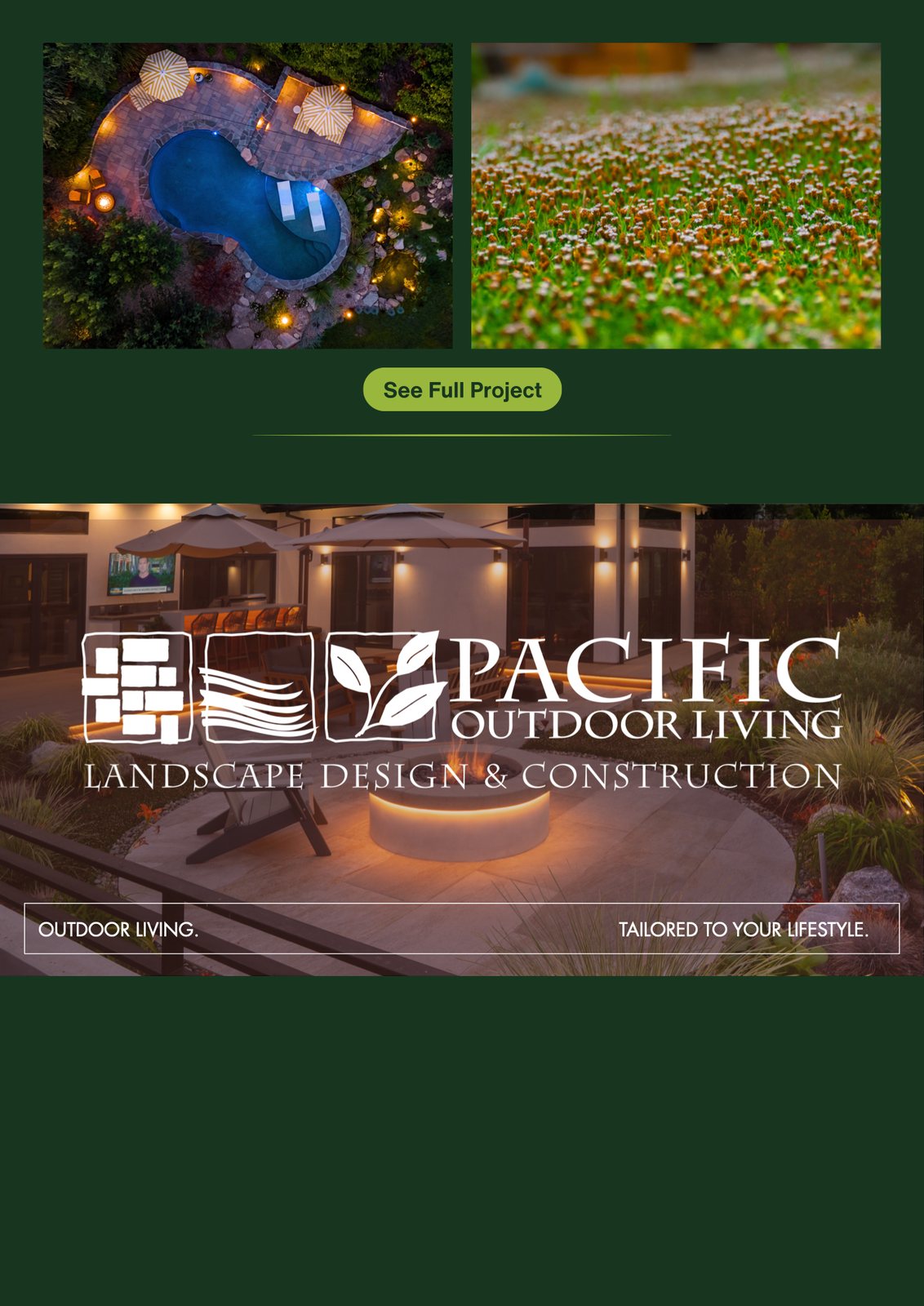
The email campaign runs the same play as the website, right in the inbox. It takes one finished backyard apart and names every decision inside it: the blue geometric tile, the natural flagstone, the pond, the sauna and cold plunge, the fire pit, the lighting, the native planting that cuts the water bill.
Each element gets a sentence on why it's there, exactly what a designer would say standing in the yard. Then two buttons, “Our Process” and “See Full Project”, pointing back at the two things on the site that do the convincing.
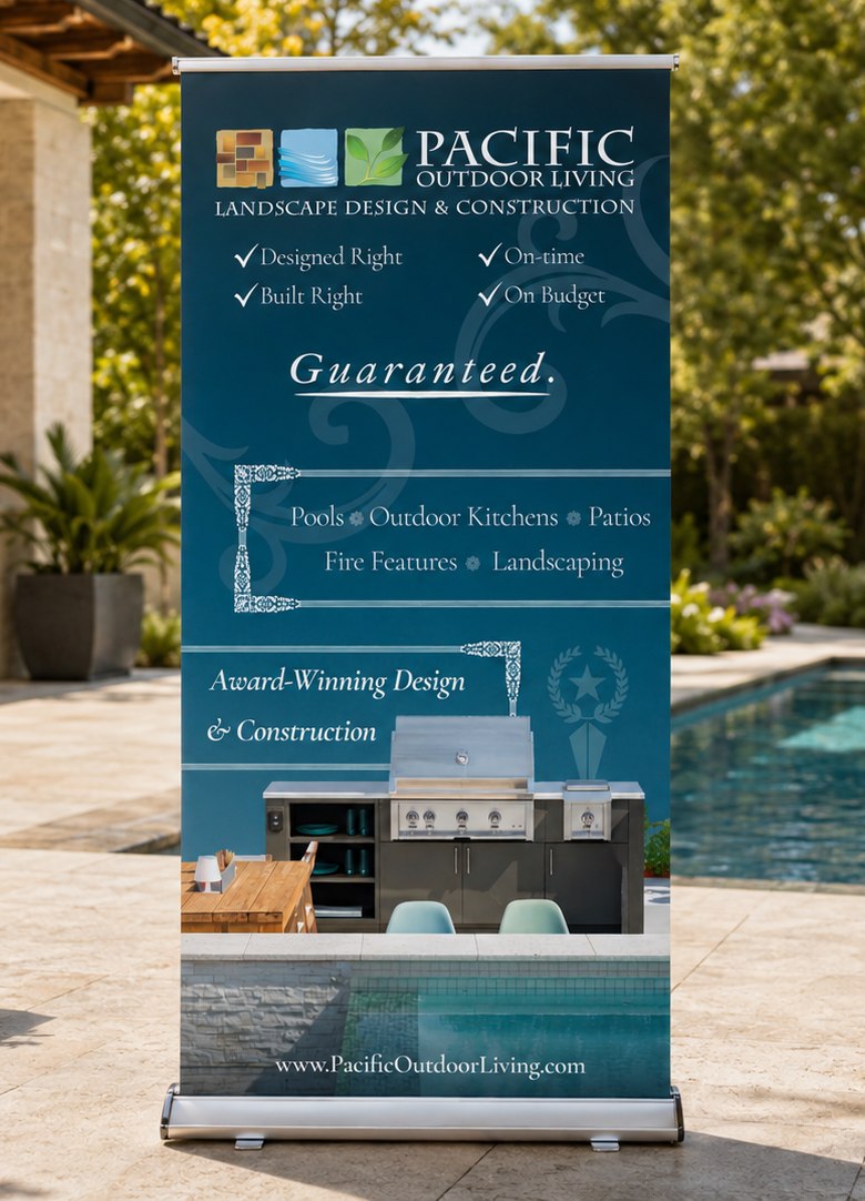
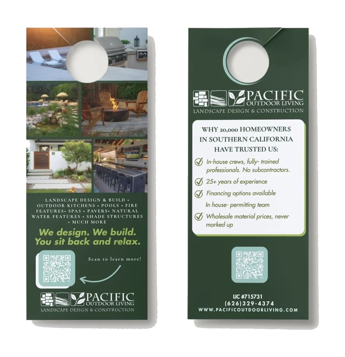
The print pieces carry the same story at both ends of the size range. The pull-up banner is the loud version, seven feet of it at a home show, where it has about two seconds to say these people build pools and outdoor kitchens and stand behind the work. The door hanger is the quiet version, distilled to its smallest form: five reasons, a QR code, and a phone number.
Hiring is a marketing story too
A design-build company grows as fast as it can hire, and a project manager reads job ads the same way a homeowner reads landscapers: on a phone, half paying attention. So the hiring stories borrow the format people already scroll, and put the whole job on one card.
Title, full-time, location, what the role involves, and how to apply. That card stays fixed across the set while the photograph behind it changes, so eleven stories read as one campaign. The backgrounds are real Pacific Outdoor Living projects, which does the other half of the job: you see what you would be building before you read what you would be doing.