Aperol Spritz Activation
An Aperol Spritz bar built under a tent at Pebble Beach Food & Wine. I worked on the team that designed and built it, on the ambience, the brand messaging and the physical setup.
Make the flavor visible
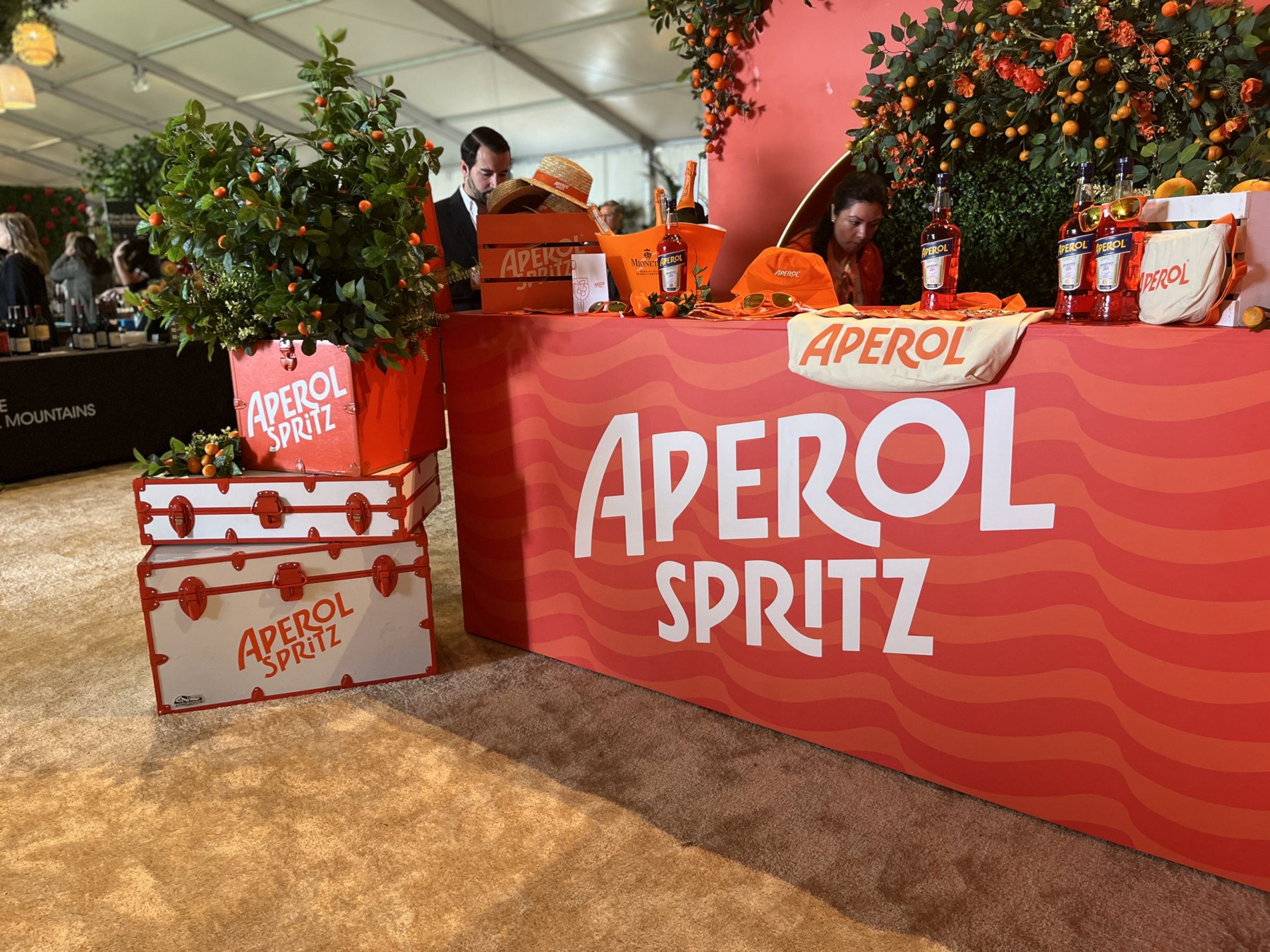
A food and wine festival is a tent full of booths competing for attention, and guests decide from about thirty feet away. So the bar grew beneath live kumquat trees, fruit still on the branches, set in coral crates at eye level along the top of the counter.
Citrus does three jobs at once here. It says bitter orange before anyone reads a word, it smells like the drink, and it lifts a flat tented space with height and shade. The ambience was my main focus, so much of my day went into placing the planting and greenery and layering it until the trees read as a true canopy overhead.
I shaped the brand messaging too, which at an activation means choosing the fewest, clearest words. Everything a guest needed to know about the drink was already in the room: the fruit, the color, the glass in someone else's hand. The words simply give it a name.
Trunks, crates, and a wall that fizzes
The facade is printed with a wavy two-tone stripe that keeps moving across the whole run of the bar. It reads as fizz, and it turns a long flat surface into something alive.
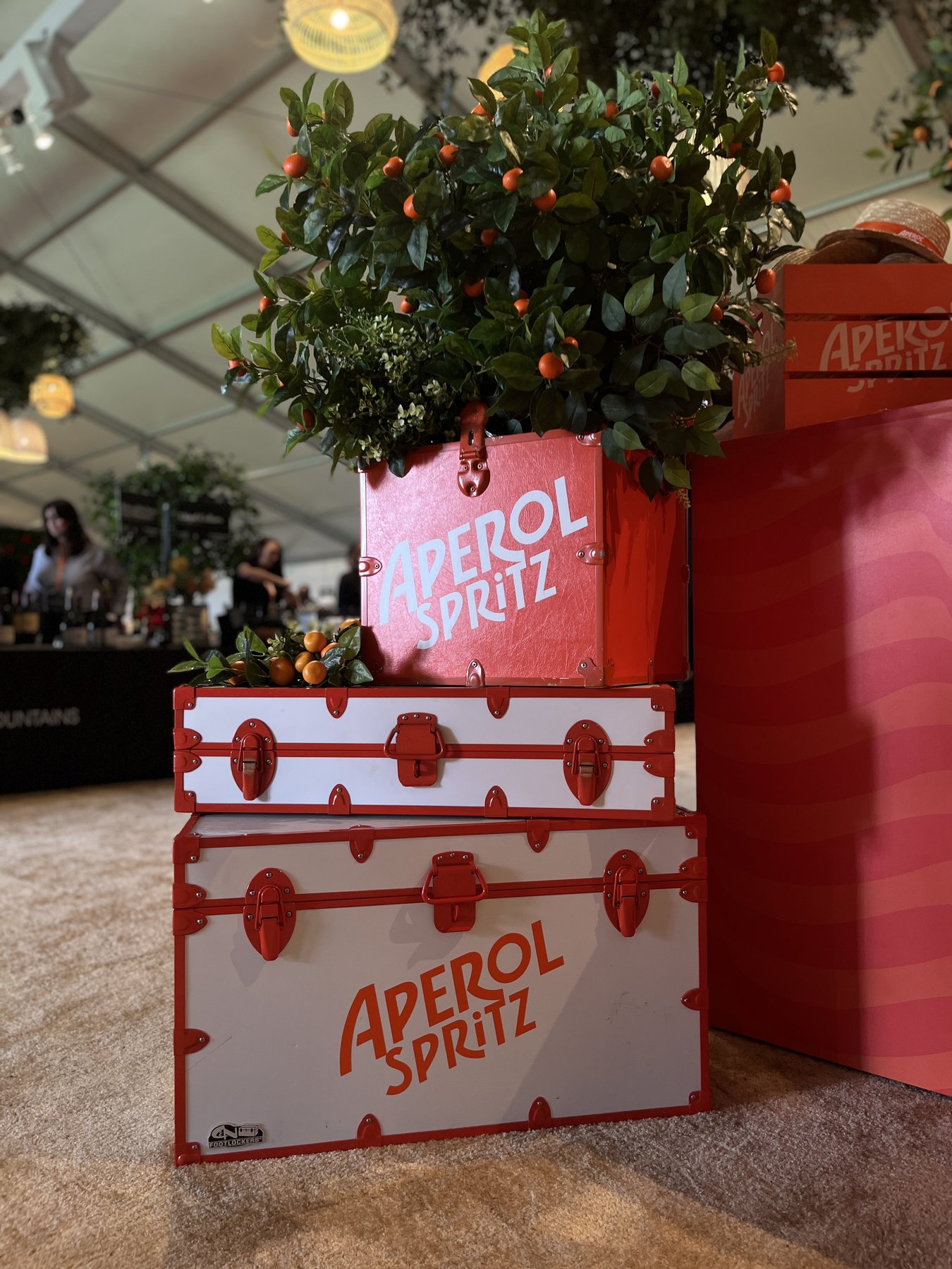
In front of it, white steamer trunks with orange banding and hardware, stacked two high. They're the hardest-working objects on the set. They hold stock, guide people away from the service side, give the photographs a foreground, and carry the Italian aperitivo-travel idea all on their own. The crates play the same trick at a smaller size and double as planters.
I was on the build for this, putting the set together and placing it. Every tent has its own personality, so plenty gets decided standing inside it: what sits in front of what, and the angle the whole scene has to sing from.
Styling the part people photograph
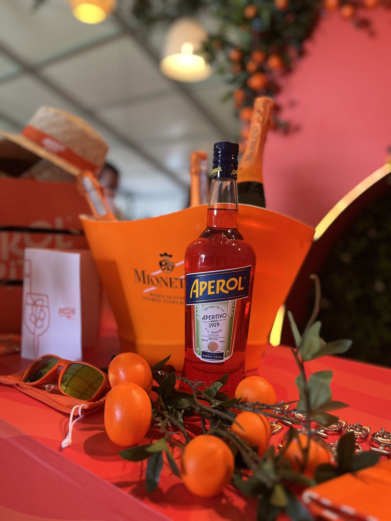
The tablescape is the part that ends up on everyone's phone, so it was styled as a set. Coral surface, the bottle and the prosecco in an Aperol ice bucket, loose kumquats and cut foliage, tinted sunglasses and a straw boater with an orange band.
Nearly everything on it is the drink, an ingredient, or something a guest could pick up and wear. Holding to those three keeps the table feeling alive and inviting.