Packaging & Label Design

Blackberry Bruises

A self-directed project about storytelling and scent, inspired by houses like Imaginary Authors. The label copy doubles as the texture.
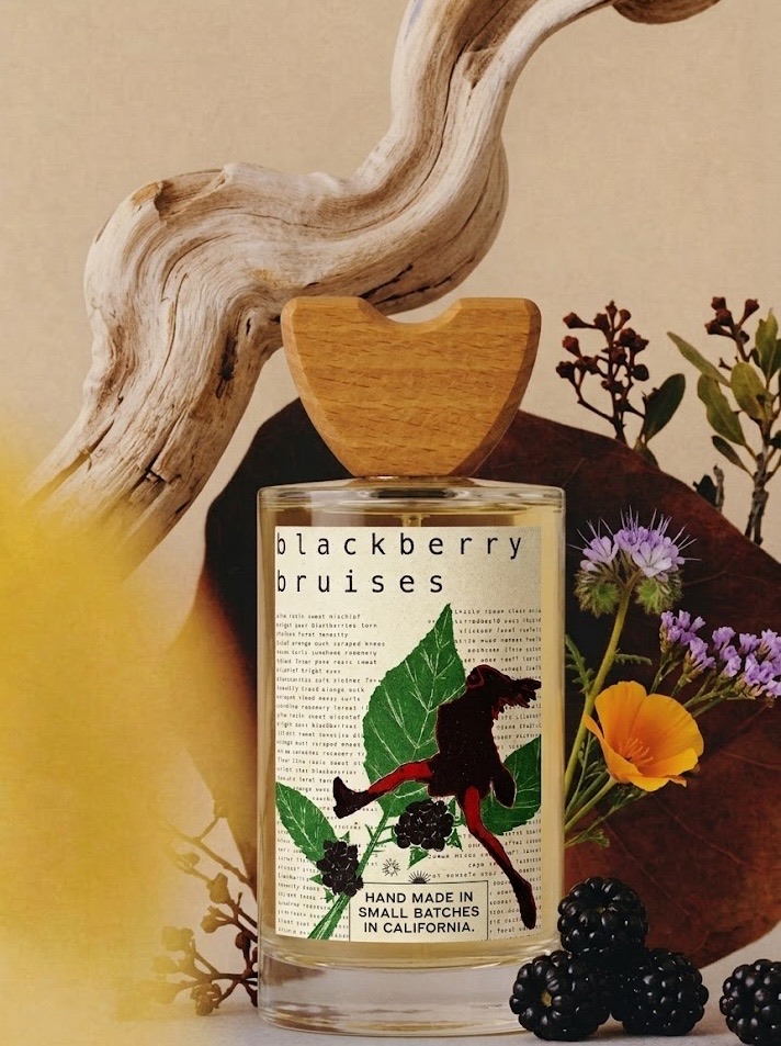
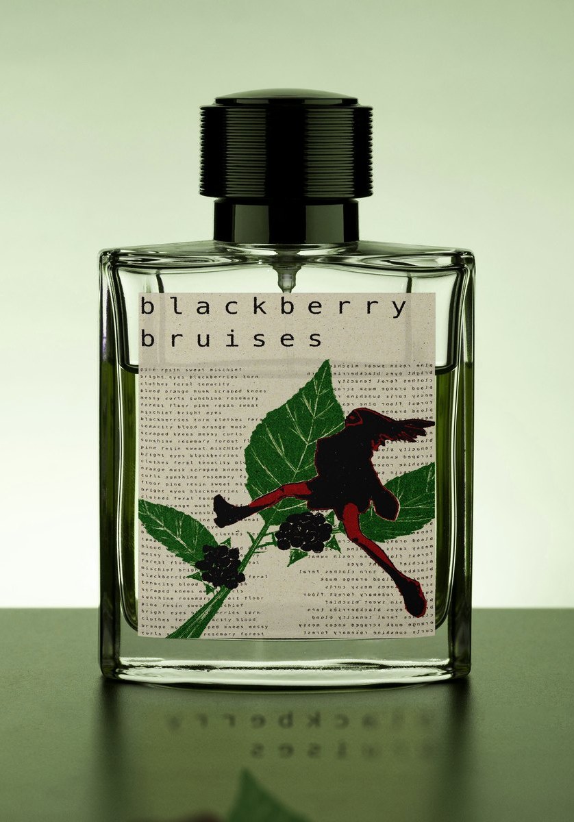
Blackberry Bruises fragrance bottle with a linocut-style label of a feral figure running through blackberry brambles.
Client
Personal / conceptual
Role
Concept, Copywriting, Illustration, Label & Packaging Design
Timeline
3 weeks
Tools
Illustrator, Photoshop
Outcome
A two-scent line with a shared visual and verbal system

The concept

I wanted a fragrance that felt like freedom, youth, and being a little feral, so I built the label out of the scent notes themselves. Pine resin, sweat, mischief, bright eyes, blackberries torn. The words run together into a dense block of type, and a linocut-style figure caught mid-motion cuts right through the middle.

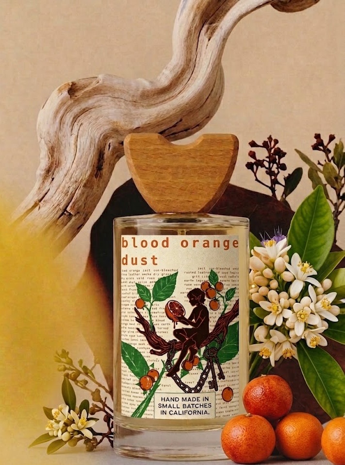
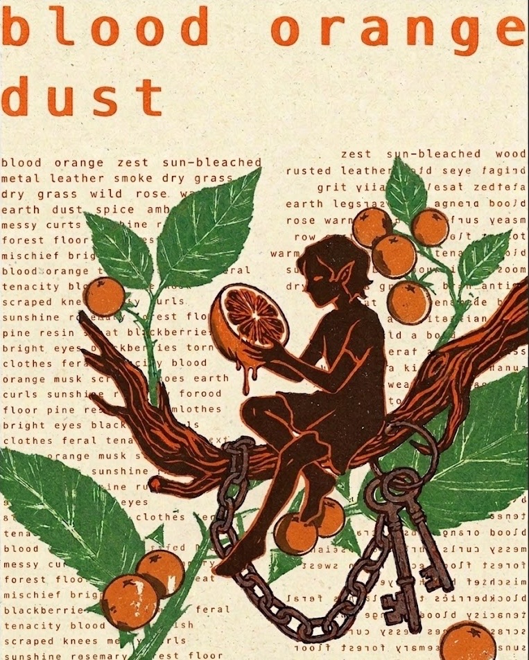
Then I carried it into a second scent, Blood Orange Dust. Same system, same words-as-texture spell, new story. This time the figure is in chains, reaching for fruit where the first one ran loose through brambles. One world, two very different moods.
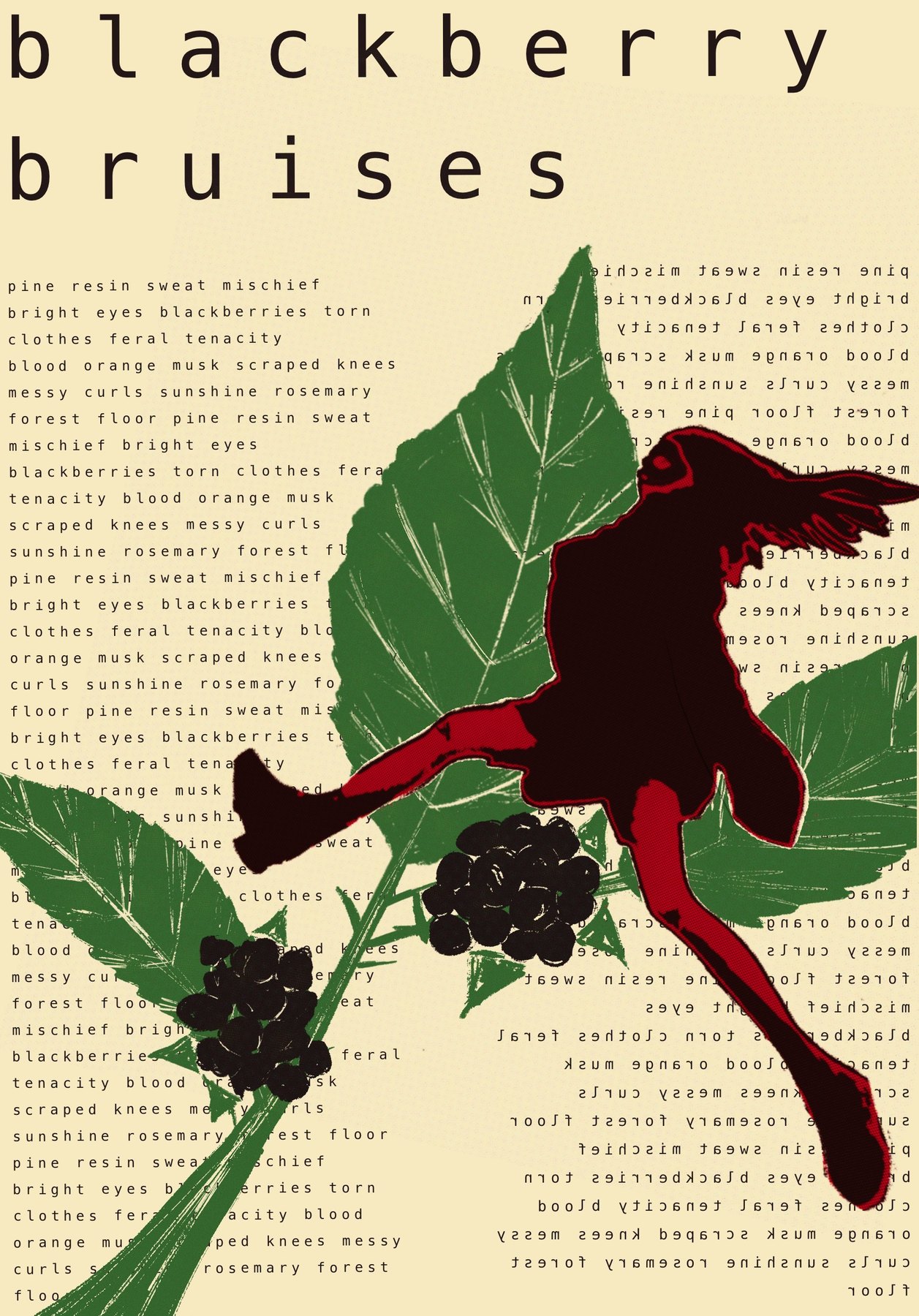
Flat label art for Blackberry Bruises: dense scent-note typography behind a running linocut figure and blackberry brambles.
The label flat. The scent notes are the texture. Read them and the whole brief unfolds.
The Blackberry Bruises bottle shot plainly against a green gradient, framed to the same proportions as the label artwork, with the label reflected in the surface below.
On the bottle. Shot flat against green so the label stands entirely on its own.