Empanadas del Surf
Empanadas del Surf sells empanadas near the water in Santa Cruz. The brief, in spirit, was a sticker you’d proudly slap on your board.
Two marks, two jobs
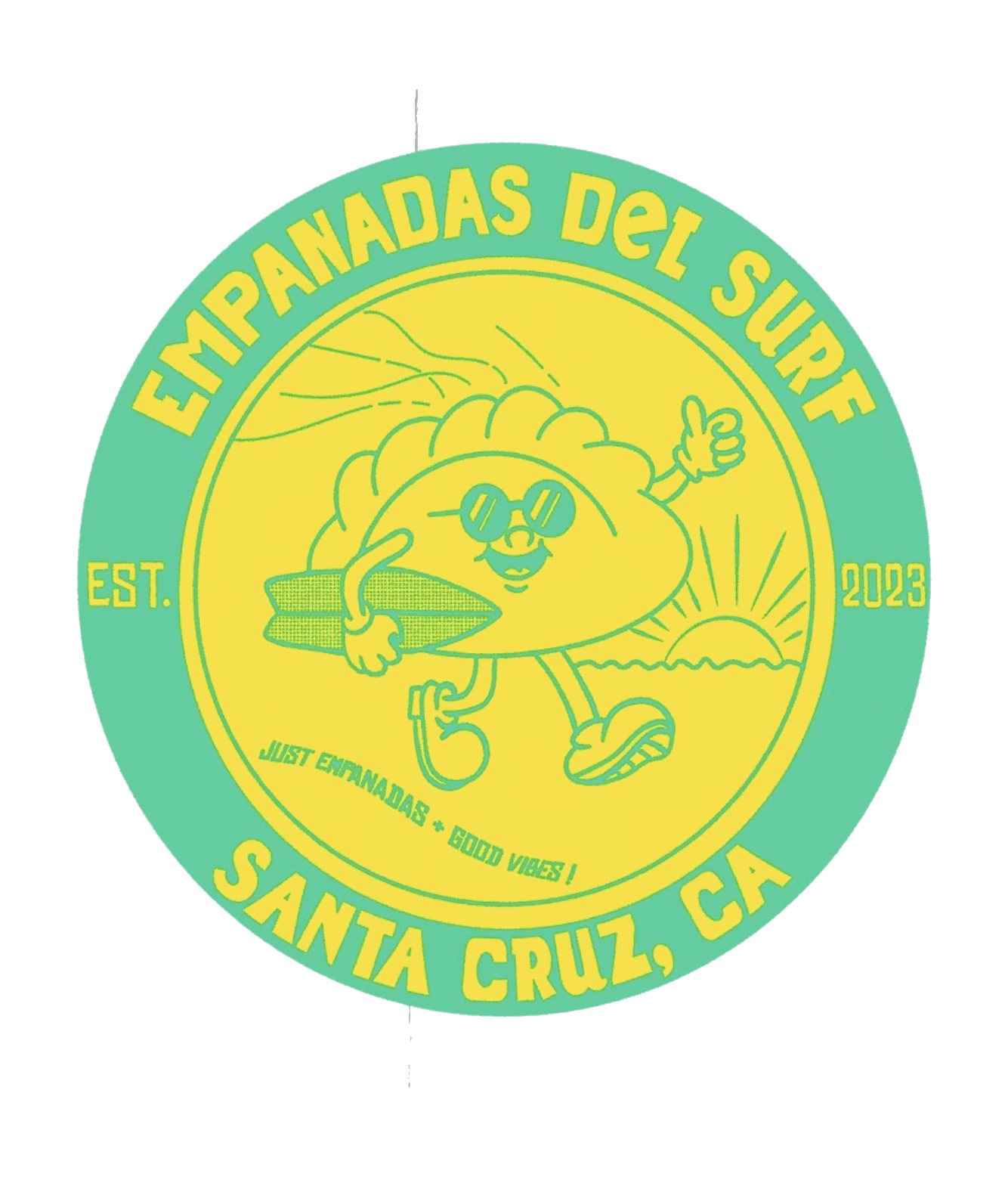
The roundel is the one that goes on everything. An empanada with legs, sunglasses and sneakers, mid-ride, sitting in a ring that carries the town, the year and a three word promise. It's built to stay crisp printed tiny and fast, the true test for a food logo: it still reads at an inch across on a napkin.
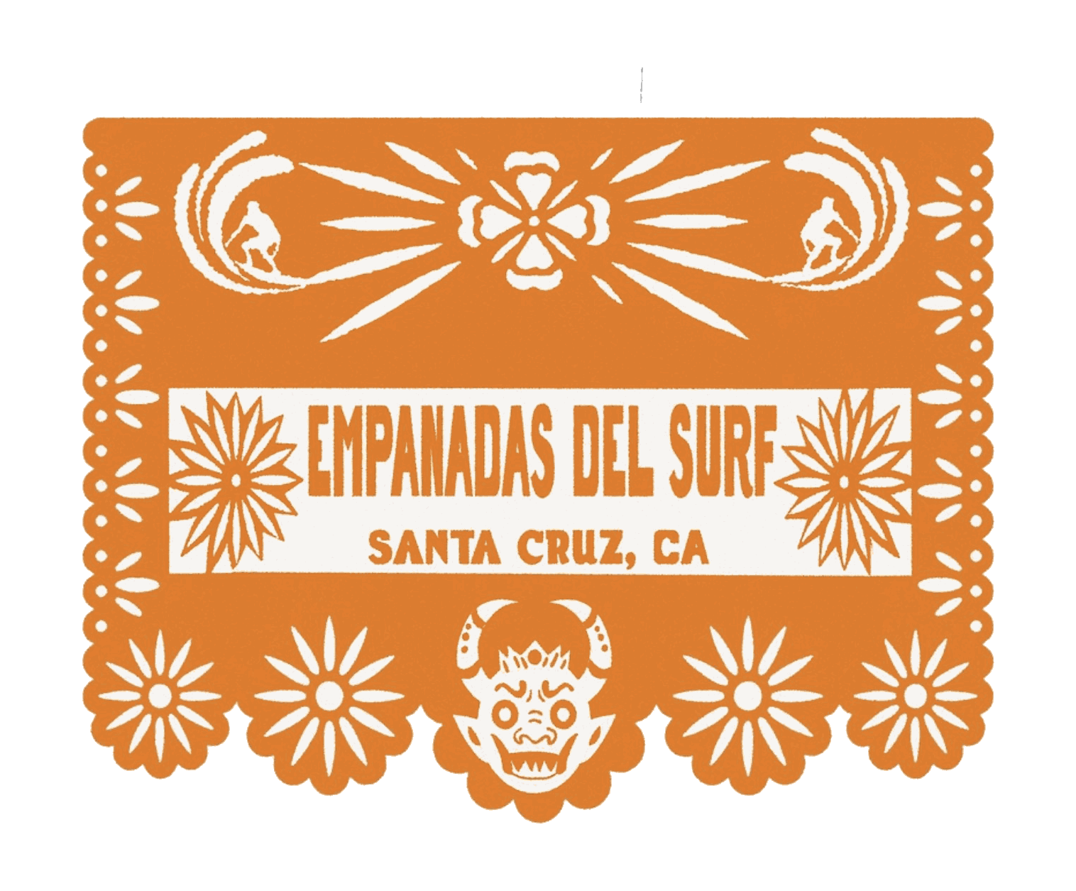
The second mark is papel picado, the cut-paper banner strung across a Mexican street party. Same name, a whole new register. The roundel is the brand saying hello, and the banner honors where the food comes from. With both in hand, the shop picks the mark each moment calls for.