Typography

Letterform Studies

Three posters where the type is the whole subject. The history of a letter set inside the letter itself, and the story of the printing press set in a spiral you turn to read.

A red poster with WAW set large in white slab letters at the top and the letter's history in justified type below.
Project
Coursework and self-directed studies
Role
Typography, poster design
Scope
Three letterform posters
Tools
Illustrator, InDesign

The letter explains itself

Waw is the sixth letter of several Semitic alphabets and the ancestor of F, U, V, W and Y. The poster builds the letter at full size and sets its entire history inside the counter, so the shape you're reading about is the shape you're reading in.

Two versions, because the same idea behaves differently on a dark ground and a saturated one. The blue one lets the hook float. The red one crops it hard and makes the letterform wrestle the text block for room.
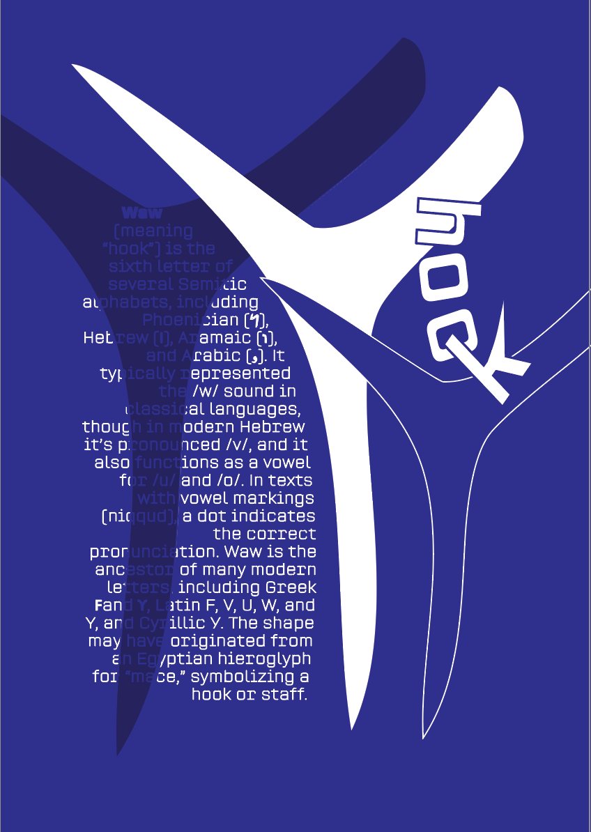
A deep blue poster with a large white hooked letterform, the history of the letter Waw set in small type inside and around it.
Waw, floating. The white form reads as a hook and a staff, which is what the letter was named after.
A red poster with WAW set large in white slab letters at the top and the letter's history in justified type below.
Waw, cropped. Same text, opposite tactic. The letter grows from an illustration into a headline.

Gutenberg, going around

The Gutenberg piece sets the story of movable type in a spiral that you physically turn the page to read. The form earns its place because the content calls for it: Gutenberg's invention freed text from being copied by hand in one continuous motion.
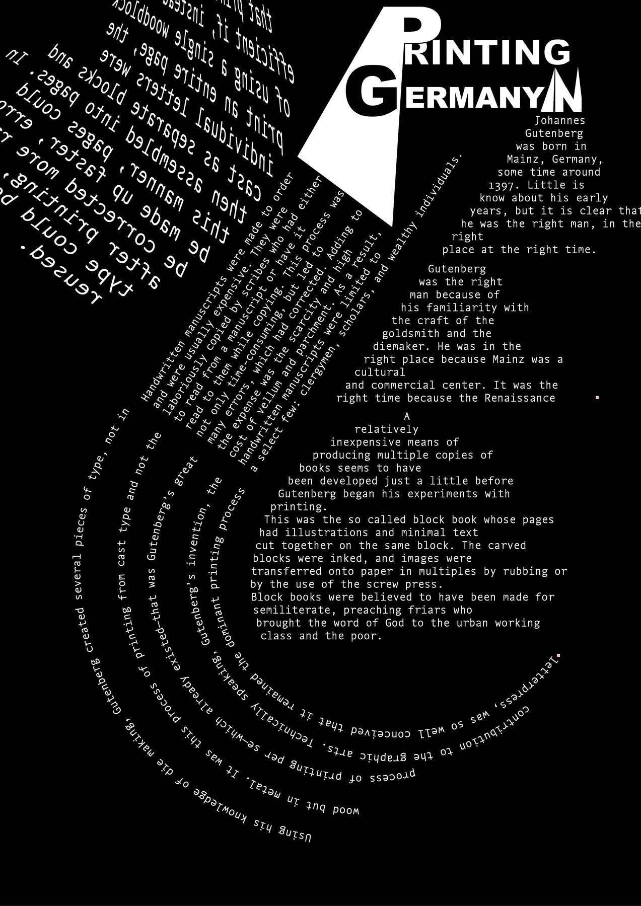
A black poster titled 'Printing Germany' in blackletter, with the history of Gutenberg and movable type set in a tight spiral of small white type around a diagonal press shape.
Read it by turning it. The form does what the subject did, the best reason to set anything in a spiral.